Spotlight
Raising awareness about senior poverty in South Korea.
Spotlight
Raising awareness about senior poverty in South Korea.


Overview
A data visualization project aimed at raising awareness about senior poverty in South Korea. This project highlights the struggles many elderly face, including financial instability, limited access to resources, and social isolation, while presenting key statistics and insights to inspire action and support for this vulnerable population.
My Role:
Researcher, Data Visualizer, Designer
Service Provided:
Data Analysis, Visual Storytelling
Tools:
Figma, Adobe Illustrator
Duration:
4 months


About the Problem
In 2020, South Korea's senior poverty rate was 40.4%, nearly three times the OECD average of 14.2%, making it the highest among the 38 member countries.
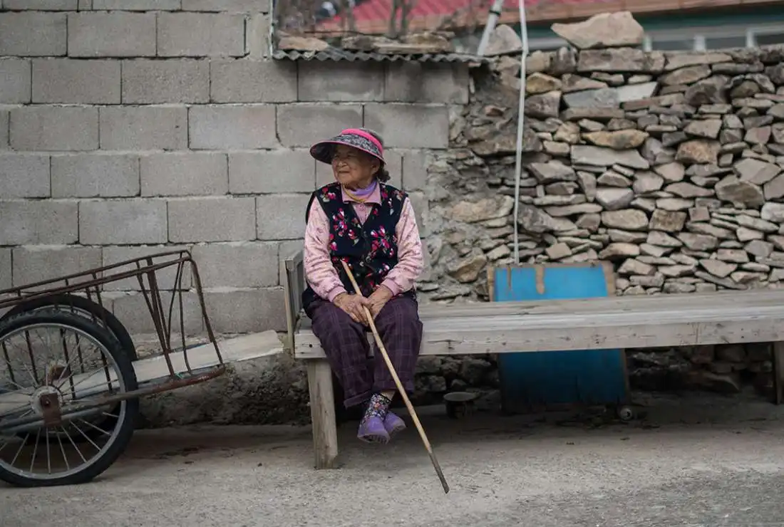
In South Korea, a significant percentage of the elderly population faces financial hardship, with many relying on minimal pensions or support. Social isolation and lack of access to resources further compound their struggles, leaving them vulnerable and overlooked.
Research
For this phase, I wanted to first learn more about the senior poverty statistics and situation in the country, then having a better understanding of the issue, I proceeded with concept ideation.
Secondary Research
Most of these statistics and facts were gathered from online publications, reports, and studies.
Facts
South Korea has the highest senior poverty rate among OECD countries, with nearly 40% of seniors living below the poverty line, highlighting significant gaps in the social safety net.
Despite the country’s rapid economic growth, only about 45% of seniors receive a public pension, leaving many dependent on low-income jobs or family support to survive.
South Korea's senior poverty contributes to the highest elderly suicide rate among developed nations, driven by financial stress and social isolation.


Initiatives
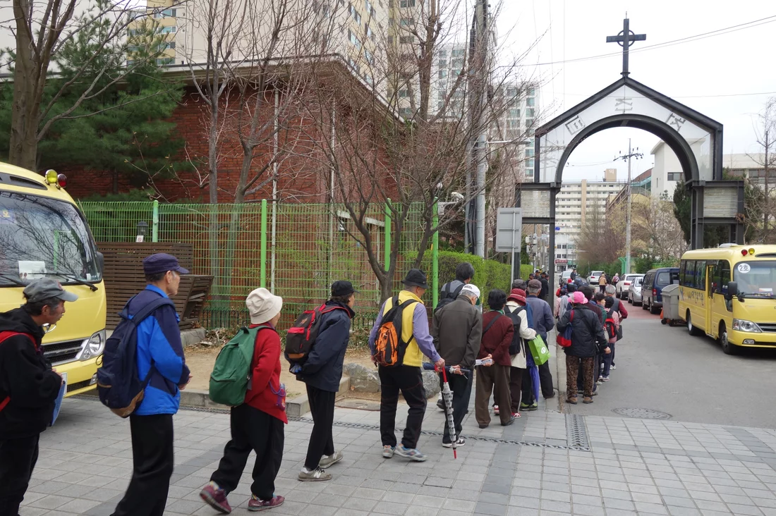
South Korea has been taking important steps to tackle senior poverty, with initiatives like the Basic Old-Age Pension and the National Pension Scheme aimed at supporting its aging population. These efforts are part of a broader commitment to reduce economic hardship among seniors, a group that faces high poverty rates.
While government actions have provided some relief, the problem cannot be fully addressed without the active involvement of society at large. Collaboration between the government, local communities, and private sectors is essential to creating sustainable solutions that ensure elderly citizens can live with dignity and security.



Synthesis (Building Empathy)
For my research on senior poverty in South Korea, I focused on gathering data to build empathy and understanding of the issues these seniors face. I used a combination of articles, reports, and statistics to analyze the root causes of senior poverty, from financial instability to limited access to healthcare and social services.


Defining the Problem
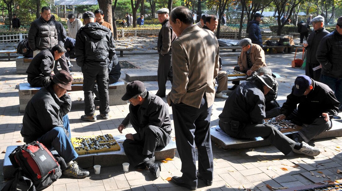
Senior poverty in South Korea is shockingly high at 40.4%, which is nearly three times the OECD average.
Seniors are facing social isolation, poor healthcare access, and struggling to meet basic living needs.
Awareness of these issues is still quite low, which means people don’t realize the gravity of the situation.
Needs
- People need to be more informed about the realities of senior poverty and how they can contribute to solutions.
- Engaging and easy to understand for different audiences to spark meaningful conversations.
- Users need clear, actionable steps to make an impact—whether it’s donating, volunteering, or simply sharing knowledge.
=


Designing Solutions
📢 Awareness Campaign: Using visuals and storytelling to showcase the daily challenges seniors face, I want to help spread awareness and start a dialogue around senior poverty.
📱 Interactive Tool: Creating an interactive platform that helps users learn about senior poverty, where they can track and see how their actions can support change.
💬 Community Support: Developing features that allow users to engage with the cause, share stories, and participate in advocacy efforts, bringing awareness to this issue through social channels.
From here, I started sketching out concepts for how to build these ideas into a more concrete design.


Sketches
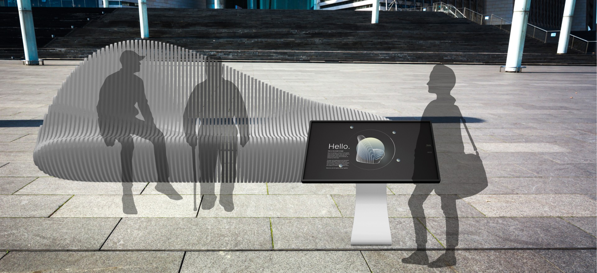
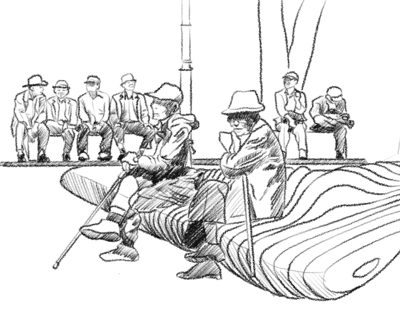
I visualized this data as a parametric/terraform bench to represent the global senior poverty rates. Each layer of the bench corresponds to the percentage of senior poverty in different countries, with the lowest layer representing the country with the smallest percentage and the highest layer representing South Korea, which has the highest rate of senior poverty. This design serves as a tangible, interactive way to illustrate the stark disparity in senior poverty rates across the world, highlighting South Korea’s critical position and the urgent need for change. The layers emphasize the scale of this issue, making the data more accessible and impactful.


Visualizing the Data
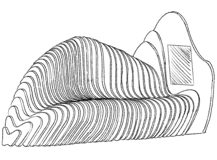
One of the concept sketches features an interactive kiosk alongside a visual of the bench side view. The bench design showcases layered heights representing different countries, with each layer displaying key statistics about senior poverty.
The kiosk allows visitors to learn more about each layer, exploring the data and stories behind the design. This combination of physical and digital elements creates an engaging and informative experience, helping visitors connect with the issue on a deeper level.

Low-Fi Prototype
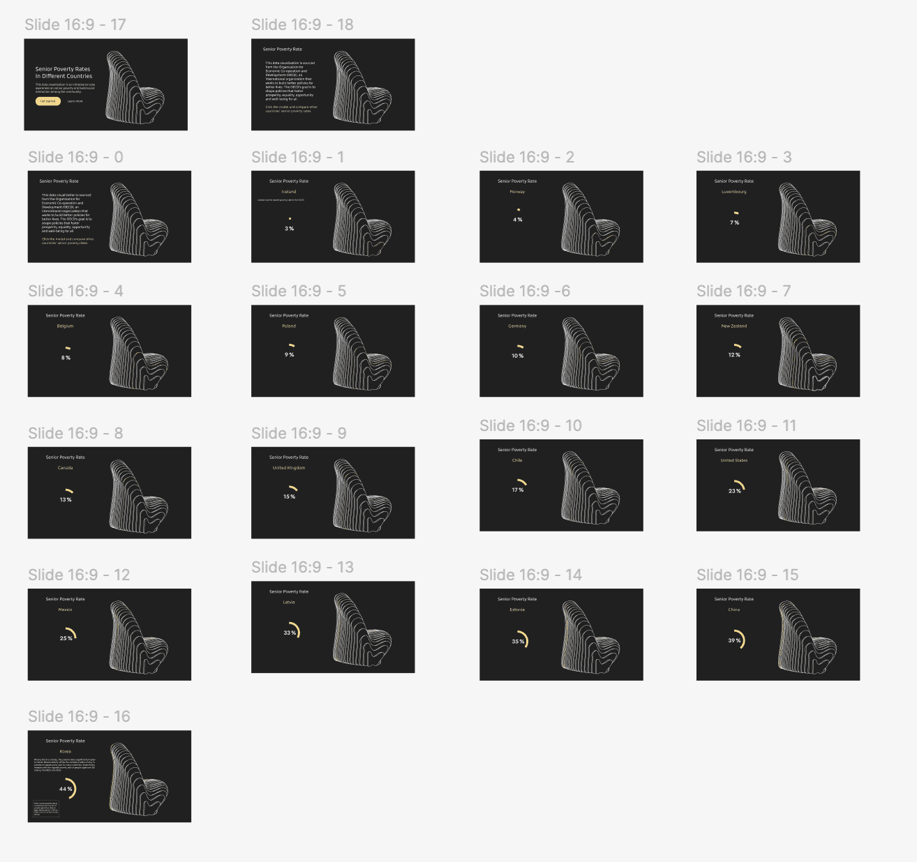
This low-fi prototype shows the side view of the bench, with each layer representing senior poverty levels in different countries through varying heights. While the bench itself is a physical part of the installation, this visual will be featured on the digital kiosk. Visitors can interact with the kiosk to explore detailed data and learn more about what each layer represents, creating a deeper understanding of the issue.
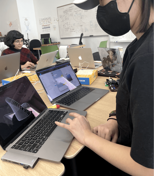

User Testing: First Round
During user testing, feedback from participants helped improve the prototype:
One user suggested changing the interactions from hovering to clicking, as the data will be displayed on a kiosk.
Another user recommended adding an on-click interaction for the radial percentage chart animation, so it doesn’t continuously loop.
A third user proposed filling the empty space on the right side by adding another data chart or relevant text.
Mid-Fi Prototype
After gathering feedback, I switched the interactions from hovering to clicking to better fit the kiosk setup. I also added some text to give users more context and information about the data and the issue. These changes were made to improve the user experience and make the information clearer and more engaging.
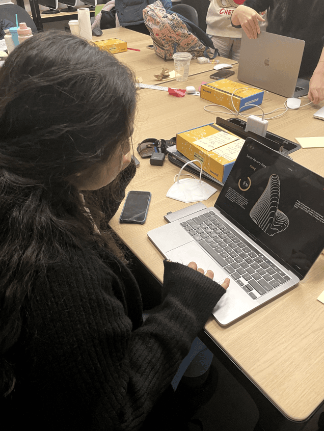

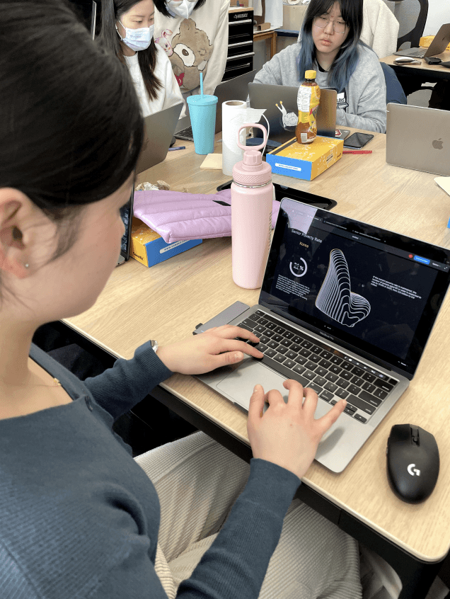

User Testing: Second Round
The feedback I received from the second round of testing included a few key points:
While the descriptions weren’t too text-heavy, it was suggested to include a bit more context about who the OECD is.
The first slide on the kiosk could include a brief description of the issue and the data source.
There was some confusion about whether the percentage referred to the country’s total population or just seniors. A suggestion was made to add a sentence under the chart like “44% of senior citizens in Korea live in poverty.”
It was recommended to include another data chart showing both the total population and the population of elderly people living in poverty.
Some additional colors, icons, fonts, or other visual cues could help enhance the design.
These insights helped refine the prototype to improve clarity and overall user experience.
High-Fi Prototype
The high-fi prototype brings the design to life with polished visuals, smooth interactions, and all the updates from user feedback. It now includes on-click interactions, context about the OECD, and a brief introduction to the issue and data source on the first slide.
High-Fi Prototype
The high-fi prototype brings the design to life with polished visuals, smooth interactions, and all the updates from user feedback. It now includes on-click interactions, context about the OECD, and a brief introduction to the issue and data source on the first slide.
High-Fi Prototype
The high-fi prototype brings the design to life with polished visuals, smooth interactions, and all the updates from user feedback. It now includes on-click interactions, context about the OECD, and a brief introduction to the issue and data source on the first slide.
High-Fi Prototype
New visual elements like colors, improved fonts, and animations make the design more engaging. This version reflects the final vision for the interactive kiosk, ensuring it’s both informative and user-friendly.
High-Fi Prototype
New visual elements like colors, improved fonts, and animations make the design more engaging. This version reflects the final vision for the interactive kiosk, ensuring it’s both informative and user-friendly.
High-Fi Prototype
New visual elements like colors, improved fonts, and animations make the design more engaging. This version reflects the final vision for the interactive kiosk, ensuring it’s both informative and user-friendly.

Usability Scenario
The bench would be installed in a park within a neighborhood or community, offering a space for both learning and connection. Users can sit and interact with the bench’s kiosk to explore information about Korea’s elderly and the issue of senior poverty. Beyond the kiosk, the bench also encourages people to engage socially, creating a space where learning and conversation come together.
Reflection
Working on the Spotlight was a deeply meaningful experience, as it allowed me to combine my design skills with an issue I’m passionate about. Senior poverty is a topic close to my heart, and this project gave me the opportunity to raise awareness in a way that’s both impactful and engaging.
One of the key lessons I learned was the importance of user feedback. From the low-fi to high-fi stages, user testing highlighted areas for improvement, such as refining interactions and adding more context to the data. These insights helped shape a design that is not only functional but also meaningful to its audience.
Another takeaway was the value of storytelling in design. By creating an interactive kiosk alongside the bench installation, I aimed to provide users with both emotional and factual connections to the issue. This process reinforced the power of combining visuals and interactivity to make data memorable and impactful.
If I could revisit this project, I would explore additional ways to enhance accessibility, like integrating multilingual options or auditory descriptions for the kiosk. These features could help reach a broader audience and make the experience more inclusive.
Overall, this project deepened my understanding of designing for social issues and strengthened my skills in prototyping, user testing, and data visualization. It reminded me of the potential design has to spark conversation, connect with people, and drive awareness about critical topics that matter.
Next Project
Next Project
Crunchsaver
Reducing food waste through fun sustainability challenges.
Mobile Service Design

